Brief:
For this body of work I am to create and design a live website design to represent myself online as well as other promotional material to support this design. Things I will produce within the design are:
a cover page
a creative cv
a biographical element
a Self portrait
Typography
logo design
decorative illustrations
This would be a product aimed at clients and potential customers hoping to use my services. My main audience could be described as upscale young adult viewers, people between the age of 18-49 who live in high earning households. It is more likely that they are people already working within the industry and are being paid to search for new talent as well as other illustrators researching work.
The context of this item is to be used as a main source of self promotion to accompany other online presences as well as physical materials I produce to be used to lead to this such as business cards.
The main reason I want to tackle this project is because I need to have a place to direct anyone that comes to see my work at exhibition or when in conversation with myself. so that they can use my services and view my portfolio. I want to create I really interesting design that will keep people looking at my work which shows off my design skills and proficiency as well as the concept of myself as an illustrator. making it easier to make a name for myself.
From doing this project I will have a greater understanding of graphic design elements such as creating work to a specific size not commonly used by illustrators. It will also provide me with a good portfolio piece in itself and show off a good range of skills to potential clients. it will give me a few web design skills as a lot of things in recent years need to be created for web as well as print.
AIMS
Complete a refined and sophisticated design to a professional standard
Manage time adequately and work at an appropriate pace
Explore new techniques and materials to broaden my own working practice
Objectives
Double check all specifications and requirements of the products before production of finals begins to ensure a high standard remains throughout
Organize efficiently with the use of checklists, post-it notes and realistic deadlines to ensure there is enough time left over after each stage in the project
Try not to limit myself during the ideas and exploration stages and get locked down in one particular process or idea as to be able to judge with method is most appropriate
TIMESCALE – 10 weeks
Weeks 1/2: Initial idea development and researching all aspects of the project as well as ordering required materials well in time for production.
Weeks 3/4: Design ideas and initial drawing as well as media experimentation.
Weeks 5/6: Continued design work transitioning into digital as the components start to come together.
Weeks 7/8: Beginning production of final piece/ pieces and refinement of designs.
Weeks 9/10: Final editorial adjustments and production whilst having continued updating through out website life to keep it fresh while having a product to show my work at the show.
Website Services:
For my website design there are a few possibilities of where I could host the site
WIX.
Wix has a really easy to use website builder which has a lot of variability of customisations. they have a range of templates aimed at different professions including and illustration template. these are useful to use as a base and then you can customise it to how it suits you. wix’ prices are quite reasonable for what you get however you do have to buy your own domain name as with any place.
I’ve been looking at https://uk.godaddy.com/ as they have really good rates for domain names with generous time spans for the active time of the domain. and its pretty easy to connect your domain to wix as they explain everything really clearly so at the moment I’m probably going to go with this service.
BeHance.
BeHance is a very artistic community sort of like an artist social network where people can look at your projects and like them. as far as I am aware its free to use and is easy enough to use. this one would make for a very professional online portfolio but I see it more as an extra presence rather than a main base for my work.
Word Press.
I have recently learned that wordpress offer websites so you can basically take your blog and turn it into a your own domain. wordpress is already nicely customisable as it has a lot of different tools to help construct your blog as well as templates to make it easier to design.
Inspiration:
one of my main influences when thinking about my website design is coming from Mcbess’ website I really like how its laid out along with the titles and rolling galleries. its a simple design that shows off the work while considering his own style.

Another of my favourite artists Luke Dixon uses a very simplistic website. Its basically a gallery portfolio with a low number of pages with options to view the images by category with a brief about section and links to his other profiles and online presences.

Other artists such a NHOJ Comics simply use a tumblr to display their work. this is a less professional looking way to advertise yourself however it still works as a website and is quite customisable. a lot of people use tumblr as well so it also gives you the ability for people to follow your site.

Useful links:
https://www.wix.com/blog/2014/03/5-web-design-tips-for-a-professional-site/
https://skillcrush.com/2013/10/03/5-killer-web-design-tips-that-will-make-your-websites-awesome/
https://blog.hubspot.com/marketing/web-design-tips
Progress:
Here is a quick run through of all the changes made to my website as I was producing it right upto today as I am constantly perfecting it.
Finals:
Website:

^ a running slideshow to show the current pages of the site incase there are problems with the link.
Logo and Portrait:

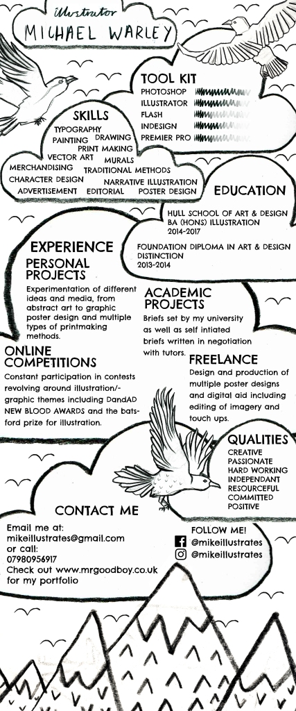
Creative CV:
The idea of this is I can use it to display my skills on my website and it can be used to send out accompanying work or portfolios.
EVALUATION:
For this project I set myself the task of creating a website to use as a base for self promotion and to display my work. I used the elements and nature of my drawings as the base for the look so that I would end up with a website that felt and looked like mine. this way it couldn’t be mistaken for anyone else’s. I think giving myself so much time to work on this project as like one of my main self initiated projects has really allowed it to develop and flourish so it has become a piece of work in itself. I’m very pleased with my outcome on this project however I want to keep editing it continuously to keep it fresh and make it the best it can be but for now I am very content with it. the main difficulties I faced were just interacting with Wix’s website builder, it is pretty easy to use and has a lot of features however so of the pre-setting’s were annoying to have to change all the time and sometimes I couldn’t get what I wanted so I had to alter my images to comply with this such as changing to transparent PNG files. the website went through a lot of changes as demonstrated by my video above but I think the major changes came when I found my style it all seemed to connect when this happened, its almost like I have my own brand now. I think my research was highly important because I never knew how to go about laying out a website before this project or how it could be undertaken. it has helped me to gain new skills as well. I think I have definitely hit the mark on this brief as it allowed me to explore myself rather than just a task. like with the creative CV I have ended with a really solid item I can use I’m various ways now. I’ve really enjoyed this project as it didn’t really feel like working it was more of just an exploratory thing where I got free reign over a design and it worked out for the best.